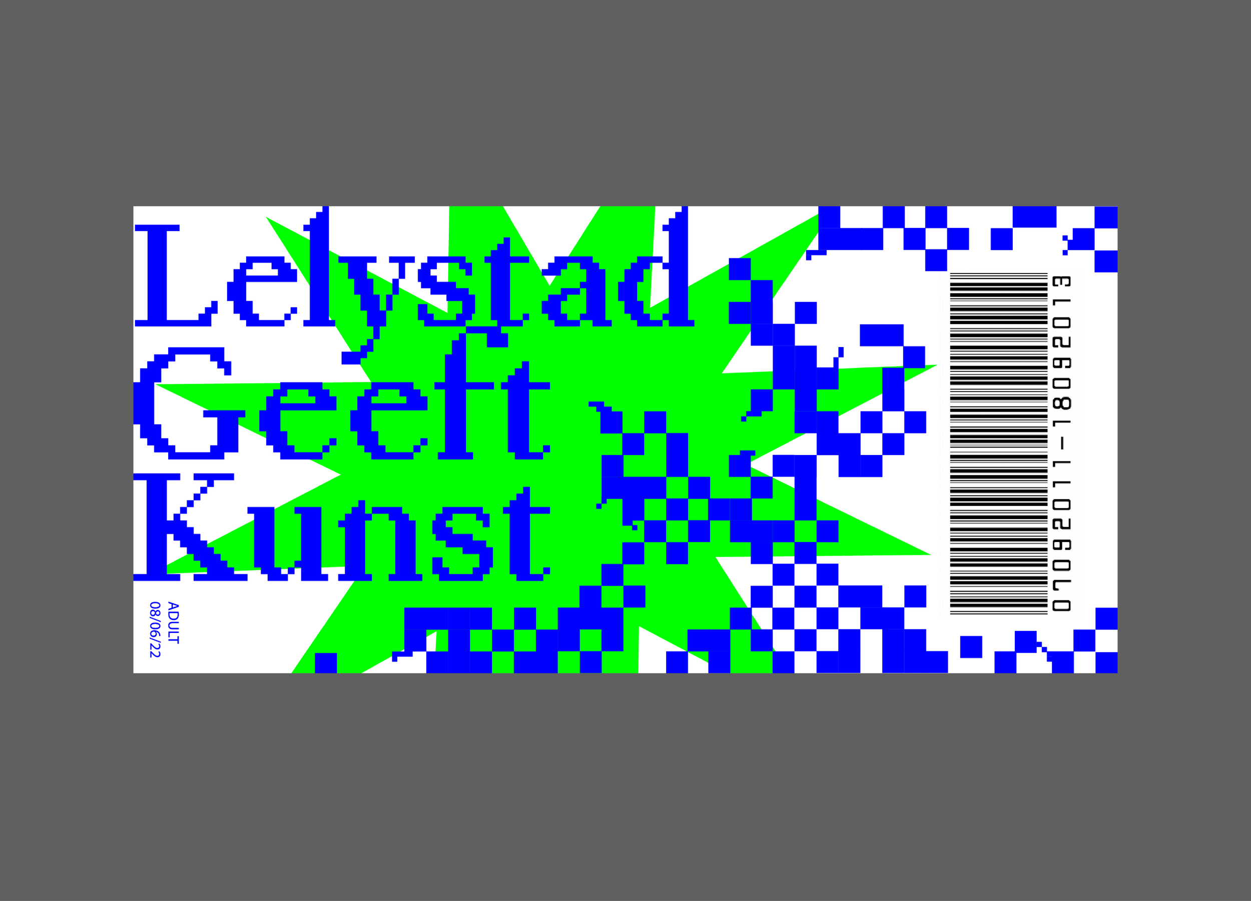
Exhibition Lelystad
Service:
Identity, Branding, Model, Floorplan
With our theme of the semester being ‘Lelystad’, a city in the Netherlands, I designed an exhibition for all the work that my classmates would make with this theme.
I used the map of the city Lelystad to place the walls of the exposition. The floor in the exhibition has a more detailled map of Lelystad. I chose this so the people that would visit the exhibition would really feel like as if they were walking on top of Lelystad.
We went to visit Lelystad and we saw that a lot of things there are square. When I would ask my classmates which word they would describe Lelystad with, they would say ‘square’. That is why I used squares in my design. All the squares together represent our works coming together in this exposition.


